CSS clip-path-Eigenschaft
Die clip-path-Eigenschaft ermöglicht die Angabe einer Ausschnittregion, die festlegt, welcher Teil des Elements angezeigt werden soll. Alle Teile außerhalb dieser Region werden ausgeblendet. Diese Eigenschaft akzeptiert vier Wertetypen:
<clip-source><basic-shape><geometry-box>none
Die veraltete clip Eigenschaft wird durch die clip-path-Eigenschaft ersetzt.
| Anfangswert | none |
|---|---|
| Gilt für | Alle Elemente. |
| Vererbbar | Nein |
| Animierbar | Ja, wenn für <basic-shape> angegeben. |
| Version | CSS Masking Module Level 1 |
| DOM-Syntax | object.style.clipPath = "none"; |
Syntax
Syntax der CSS clip-path-Eigenschaft
css
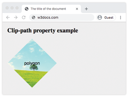
clip-path: <clip-source> | <basic-shape> | <geometry-box> | none | initial | inherit | unset;Beispiel für die clip-path-Eigenschaft:
Beispiel für die CSS clip-path-Eigenschaft mit einem basic-shape-Wert
html
<!DOCTYPE html>
<html>
  <head>
    <title>The title of the document</title>
    <style>
      body {
        margin: 0;
        padding: 0;
        background-color: #eee;
      }
      .container {
        display: grid;
        grid-template-columns: 200px 200px 200px;
        grid-template-rows: 200px 200px 200px;
        grid-gap: 20px;
        justify-content: center;
      }
      .container div {
        background-image: url("https://de.w3docs.com/uploads/media/default/0001/01/b408569013c0bb32b2afb0f0d45e93e982347951.jpeg");
        background-position: center;
        background-size: cover;
        color: #000;
        font-size: 18px;
        font-family: sans-serif;
        display: flex;
        justify-content: center;
        align-items: center;
      }
      .example {
        clip-path: polygon(50% 0%, 100% 50%, 50% 100%, 0% 50%);
      }
    </style>
  </head>
  <body>
    <h1>Clip-path property example</h1>
    <div class="container">
      <div class="example">polygon</div>
    </div>
  </body>
</html>Ergebnis
Beispiel für die clip-path-Eigenschaft mit allen Werten:
Beispiel für die CSS clip-path-Eigenschaft mit globalen und basic-shape-Werten
html
<!DOCTYPE html>
<html>
  <head>
    <title>Title of the document</title>
    <style>
      body {
        margin: 0;
        padding: 0;
        background-color: #eee;
      }
      .container {
        display: grid;
        grid-template-columns: 200px 200px 200px;
        grid-template-rows: 200px 200px 200px;
        grid-gap: 20px;
        justify-content: center;
      }
      .container > div {
        background-image: url(https://de.w3docs.com/uploads/media/default/0001/01/b408569013c0bb32b2afb0f0d45e93e982347951.jpeg);
        background-position: center;
        background-size: cover;
        color: #000;
        font-size: 18px;
        font-family: sans-serif;
        display: flex;
        justify-content: center;
        align-items: center;
      }
      .box1 {
        clip-path: none;
      }
      .box2 {
        clip-path: inset(25% 0 25% 0 round 0 25% 0 25%);
        /* values are from-top, from-right, from-bottom, from-left, and optional round keyword for border-radius */
      }
      .box3 {
        clip-path: circle(50% at 50% 50%);
      }
      .box4 {
        clip-path: polygon(50% 0%, 100% 50%, 50% 100%, 0% 50%);
      }
      .box5 {
        clip-path: ellipse(90px 50px at 100px 100px);
      }
      .box6 {
        clip-path: inherit;
      }
      .box7 {
        clip-path: initial;
      }
      .box8 {
        clip-path: unset;
      }
    </style>
  </head>
  <body>
    <h2>Clip-path property example</h2>
    <div class="container">
      <div class="box1">none</div>
      <div class="box2">inset</div>
      <div class="box3">circle</div>
      <div class="box4">polygon</div>
      <div class="box5">ellipse</div>
      <div class="box6">inherit</div>
      <div class="box7">initial</div>
      <div class="box8">unset</div>
    </div>
  </body>
</html>Werte
| Wert | Beschreibung |
|---|---|
<clip-source> | Die <url>, die auf ein SVG <clipPath>-Element verweist. |
<basic-shape> | Eine grundlegende Formfunktion wie circle(), ellipse(), inset() oder polygon(). Kann mit einem <geometry-box> durch einen Schrägstrich (/) kombiniert werden. |
<geometry-box> | Definiert die Referenzbox für die Grundform (z. B. border-box, padding-box, content-box, margin-box). |
| none | Es wird kein Ausschnittspfad erstellt. |
Hinweis: initial, inherit und unset sind globale CSS-Werte und können mit jeder Eigenschaft verwendet werden.
Praxis
Was bewirkt die CSS clip-path-Eigenschaft?