CSS grid-auto-flow-Eigenschaft
Die Eigenschaft grid-auto-flow steuert, wie automatisch platzierte Elemente in das Grid eingefügt werden.
Diese Eigenschaft hat die folgenden Werte: row, column, dense, row-dense, column-dense. Wenn weder der Wert „row“ noch „column“ angegeben ist, wird „row“ angenommen.
Die Eigenschaft grid-auto-flow kann entweder ein einzelnes Schlüsselwort (dense, column oder row) oder zwei Schlüsselwörter (column-dense oder row-dense) haben.
| Anfangswert | row |
|---|---|
| Gilt für | Grid-Container. |
| Vererbt | Nein. |
| Animierbar | Nein. |
| Version | CSS Grid Layout Module Level 1 |
| DOM-Syntax | object.style.gridAutoFlow = "row"; |
Syntax
Syntax der CSS-Eigenschaft grid-auto-flow
css
grid-auto-flow: row | column | dense | row-dense | column-dense | initial | inherit;Beispiel: grid-auto-flow: column
html
<!DOCTYPE html>
<html>
  <head>
    <title>Title of the document</title>
    <style>
      .grey-container {
        display: grid;
        grid-template-columns: auto auto auto;
        grid-template-rows: auto auto;
        grid-auto-flow: column;
        gap: 10px;
        background-color: #ccc;
        padding: 10px;
      }
      .grey-container > div {
        background-color: #eee;
        text-align: center;
        padding: 20px 0;
        font-size: 30px;
      }
    </style>
  </head>
  <body>
    <h2>Grid-auto-flow property example</h2>
    <h3>grid-auto-flow: column</h3>
    <div class="grey-container">
      <div>1</div>
      <div>2</div>
      <div>3</div>
      <div>4</div>
    </div>
  </body>
</html>Hier werden die Elemente platziert, indem jede Spalte gefüllt wird. Im folgenden Beispiel sehen wir, dass die Elemente durch das Füllen jeder Zeile platziert werden.
Beispiel: grid-auto-flow: row
html
<!DOCTYPE html>
<html>
  <head>
    <title>Title of the document</title>
    <style>
      .white-container {
        display: grid;
        grid-template-columns: auto auto auto;
        grid-template-rows: auto auto;
        grid-auto-flow: row;
        gap: 10px;
        background-color: #ccc;
        padding: 10px;
      }
      .white-container > div {
        background-color: #fff;
        text-align: center;
        padding: 20px 0;
        font-size: 30px;
      }
    </style>
  </head>
  <body>
    <h2>Grid-auto-flow property example</h2>
    <h3>grid-auto-flow: row</h3>
    <div class="white-container">
      <div>1</div>
      <div>2</div>
      <div>3</div>
      <div>4</div>
    </div>
  </body>
</html>Beispiel: grid-auto-flow: row (mit expliziter Platzierung)
html
<!DOCTYPE html>
<html>
  <head>
    <title>Title of the document</title>
    <style>
      .grey-container {
        height: 250px;
        width: 250px;
        display: grid;
        gap: 20px;
        grid-template: repeat(4, 1fr) / repeat(2, 1fr);
        grid-auto-flow: row;
        background-color: #ccc;
        padding: 10px;
      }
      .box1 {
        background-color: #00f3ff;
        grid-row-start: 3;
      }
      .box2 {
        background-color: #ff00d4;
      }
      .box3 {
        background-color: #827c7c;
      }
      .box4 {
        grid-column-start: 2;
        background-color: orange;
      }
    </style>
  </head>
  <body>
    <div class="grey-container">
      <div class="box1"></div>
      <div class="box2"></div>
      <div class="box3"></div>
      <div class="box4"></div>
    </div>
  </body>
</html>Ergebnis
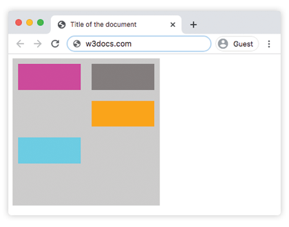
Beispiel: grid-auto-flow: column (mit expliziter Platzierung)
html
<!DOCTYPE html>
<html>
  <head>
    <title>Title of the document</title>
    <style>
      .grey-container {
        height: 250px;
        width: 250px;
        display: grid;
        gap: 20px;
        grid-template: repeat(4, 1fr) / repeat(2, 1fr);
        grid-auto-flow: column;
        background-color: #ccc;
        padding: 10px;
      }
      .box1 {
        background-color: #00f3ff;
        grid-row-start: 3;
      }
      .box2 {
        background-color: #827c7c;
      }
      .box3 {
        background-color: #ff00d4;
      }
      .box4 {
        grid-column-start: 2;
        background-color: #4cbb13;
      }
    </style>
  </head>
  <body>
    <div class="grey-container">
      <div class="box1"></div>
      <div class="box2"></div>
      <div class="box3"></div>
      <div class="box4"></div>
    </div>
  </body>
</html>Beispiel: grid-auto-flow: column-dense
html
<!DOCTYPE html>
<html>
  <head>
    <title>Title of the document</title>
    <style>
      .grey-container {
        height: 250px;
        width: 250px;
        display: grid;
        gap: 20px;
        grid-template: repeat(4, 1fr) / repeat(2, 1fr);
        grid-auto-flow: column-dense;
        background-color: #ccc;
        padding: 10px;
      }
      .box1 {
        background-color: #0ad6e0;
        grid-row-start: 3;
      }
      .box2 {
        background-color: #841c72;
      }
      .box3 {
        background-color: #827c7c;
      }
      .box4 {
        grid-column-start: 2;
        background-color: #4cbb13;
      }
    </style>
  </head>
  <body>
    <div class="grey-container">
      <div class="box1"></div>
      <div class="box2"></div>
      <div class="box3"></div>
      <div class="box4"></div>
    </div>
  </body>
</html>Beispiel: grid-auto-flow: row-dense
html
<!DOCTYPE html>
<html>
  <head>
    <title>Title of the document</title>
    <style>
      .grey-container {
        height: 250px;
        width: 250px;
        display: grid;
        gap: 20px;
        grid-template: repeat(4, 1fr) / repeat(2, 1fr);
        grid-auto-flow: row-dense;
        background-color: #ccc;
        padding: 10px;
      }
      .box1 {
        background-color: #0ad6e0;
        grid-row-start: 3;
      }
      .box2 {
        background-color: #841c72;
      }
      .box3 {
        background-color: #827c7c;
      }
      .box4 {
        grid-column-start: 2;
        background-color: #4cbb13;
      }
    </style>
  </head>
  <body>
    <div class="grey-container">
      <div class="box1"></div>
      <div class="box2"></div>
      <div class="box3"></div>
      <div class="box4"></div>
    </div>
  </body>
</html>Werte
| Wert | Beschreibung | Ausprobieren |
|---|---|---|
| row | Platziert Elemente, indem jede Zeile gefüllt wird, und fügt bei Bedarf neue Zeilen hinzu. Dies ist der Standardwert dieser Eigenschaft. | Ausprobieren » |
| column | Platziert Elemente, indem jede Spalte gefüllt wird, und fügt bei Bedarf neue Spalten hinzu. | Ausprobieren » |
| dense | Platziert Elemente so, dass alle Lücken im Grid gefüllt werden, unabhängig von der Größe der Elemente. Dadurch können automatisch platzierte Elemente außerhalb der DOM-Reihenfolge erscheinen. | Ausprobieren » |
| row-dense | Platziert Elemente, indem jede Zeile gefüllt wird, und füllt Lücken im Grid. | Ausprobieren » |
| column-dense | Platziert Elemente, indem jede Spalte gefüllt wird, und füllt Lücken im Grid. | Ausprobieren » |
| initial | Verwendet für die Eigenschaft ihren Standardwert. | |
| inherit | Erbt die Eigenschaft vom übergeordneten Element. |
Practice
What does the CSS grid-auto-flow property do?