CSS stroke-linecap-Eigenschaft
Die stroke-linecap-Eigenschaft bestimmt die Form der Endkappen auf dem Pfadstrich in SVG.
Wenn es als Präsentationsattribut verwendet wird, kann es von CSS überschrieben werden. Wenn es in Inline-Stilen verwendet wird, hat es Vorrang vor externem CSS.
INFO
Die stroke-linecap-Eigenschaft kann sowohl als CSS-Eigenschaft als auch als SVG-Präsentationsattribut verwendet werden. Sie kann auf jedes Element angewendet werden, wirkt sich jedoch nur auf folgende aus: <altGlyph>, <path>, <polyline>, <line>, <text>, <textPath>, <tref> und <tspan>.
| Anfangswert | butt |
|---|---|
| Anwendbar auf | Formen und Textinhaltselemente. |
| Vererbbar | Ja. |
| Animierbar | Nein. |
| Version | SVG 1.1-Spezifikation |
| DOM-Syntax | Object.strokeLinecap = "round"; |
Syntax
CSS stroke-linecap-Syntax
css
stroke-linecap: butt | square | round | initial | inherit;Beispiel für die stroke-linecap-Eigenschaft:
CSS stroke-linecap-Codebeispiel
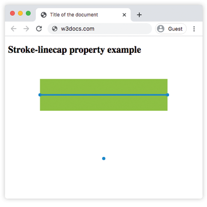
html
<!DOCTYPE html>
<html>
  <head>
    <title>Title of the document</title>
  </head>
  <body>
    <h2>Stroke-linecap property example</h2>
    <svg viewBox="0 0 6 4">
      <!-- Effect of the "butt" value -->
      <path d="M1,1 h4" stroke="#8ebf42"
        stroke-linecap="butt" />
      <!-- Effect of the "butt" value on a zero length path -->
      <path d="M3,3 h0" stroke="#8ebf42"
        stroke-linecap="butt" />
      <!--
        the following pink lines highlight the
        position of the path for each stroke
        -->
      <path d="M1,1 h4" stroke="#1c87c9" stroke-width="0.05" />
      <circle cx="1" cy="1" r="0.05" fill="#1c87c9" />
      <circle cx="5" cy="1" r="0.05" fill="#1c87c9" />
      <circle cx="3" cy="3" r="0.05" fill="#1c87c9" />
    </svg>
  </body>
</html>Ergebnis
Beispiel für die stroke-linecap-Eigenschaft mit dem Wert „round“:
CSS stroke-linecap round-Beispiel
html
<!DOCTYPE html>
<html>
  <head>
    <title>Title of the document</title>
  </head>
  <body>
    <h2>Stroke-linecap property example</h2>
    <svg viewBox="0 0 6 4">
      <!-- Effect of the "round" value -->
      <path d="M1,1 h4" stroke="#8ebf42" stroke-linecap="round" />
      <!-- Effect of the "round" value on a zero length path -->
      <path d="M3,3 h0" stroke="#8ebf42" stroke-linecap="round" />
      <!--
      the following pink lines highlight the
      position of the path for each stroke
      -->
      <path d="M1,1 h4" stroke="#1c87c9" stroke-width="0.05" />
      <circle cx="1" cy="1" r="0.05" fill="#1c87c9" />
      <circle cx="5" cy="1" r="0.05" fill="#1c87c9" />
      <circle cx="3" cy="3" r="0.05" fill="#1c87c9" />
    </svg>
  </body>
</html>Beispiel für die stroke-linecap-Eigenschaft mit dem Wert „square“:
CSS stroke-linecap square-Beispiel
html
<!DOCTYPE html>
<html>
  <head>
    <title>Title of the document</title>
  </head>
  <body>
    <h2>Stroke-linecap property example</h2>
    <svg viewBox="0 0 6 4">
      <!-- Effect of the "square" value -->
      <path d="M1,1 h4" stroke="#8ebf42" stroke-linecap="square" />
      <!-- Effect of the "square" value on a zero length path -->
      <path d="M3,3 h0" stroke="#8ebf42" stroke-linecap="square" />
      <!--
        the following pink lines highlight the
        position of the path for each stroke
        -->
      <path d="M1,1 h4" stroke="#1c87c9" stroke-width="0.05" />
      <circle cx="1" cy="1" r="0.05" fill="#1c87c9" />
      <circle cx="5" cy="1" r="0.05" fill="#1c87c9" />
      <circle cx="3" cy="3" r="0.05" fill="#1c87c9" />
    </svg>
  </body>
</html>Werte
| Wert | Beschreibung |
|---|---|
| butt | Beendet den Strich mit einem scharfen Winkel. Bei einem Teilpfad der Länge null wird der Pfad nicht gerendert. Dies ist der Standardwert. |
| square | Verlängert den Strich über die Länge des Pfads hinaus. |
| round | Macht die Start- und Endpunkte rund. |
| initial | Standard-CSS-Schlüsselwort, das die Eigenschaft auf ihren Standardwert zurücksetzt. |
| inherit | Standard-CSS-Schlüsselwort, das die Eigenschaft von ihrem übergeordneten Element erbt. |
Practice
Worauf wirkt sich die CSS-Eigenschaft 'stroke-linecap' aus?