CSS :disabled-Pseudoklasse
Die :disabled-Pseudoklasse wählt Elemente aus, die deaktiviert sind, und formatiert sie.
Bei diesen Elementen handelt es sich in der Regel um Formular-Elemente, wie z. B. Buttons (<button>), Auswahllisten (<select>), Eingabefelder (<input>) und Textbereiche (<textarea>).
Deaktivierte Elemente akzeptieren keine Klicks, Texteingaben oder den Fokus.
Version
CSS Basic User Interface Module Level 3
Syntax
Beispiel für die CSS :disabled-Syntax
css
:disabled {
  css declarations;
}
Beispiel zum Festlegen einer Hintergrundfarbe für ein deaktiviertes <input>-Element:
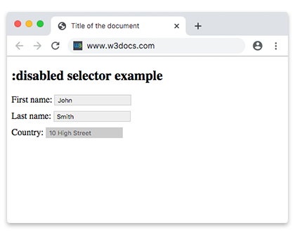
CSS :disabled-Codebeispiel
html
<!DOCTYPE html>
<html>
  <head>
    <title>Title of the document</title>
    <style>
      input {
        padding: 2px 5px;
        margin-bottom: 10px;
        border: 1px solid #ccc;
      }
      input[type=text]:enabled {
        background: #eee;
      }
      input[type=text]:disabled {
        background: #ccc;
      }
    </style>
  </head>
  <body>
    <h2>:disabled selector example for input</h2>
    <form action="">
      <label for="name">First name:</label>
      <input type="text" value="John" id="name" />
      <br />
      <label for="lastname">Last name:</label>
      <input type="text" value="Smith" id="lastname" />
      <br />
      <label for="country">Country:</label>
      <input type="text" disabled="disabled" value="10 High Street" id="country" />
    </form>
  </body>
</html>Beispiel zum Festlegen einer Hintergrundfarbe für deaktivierte <option>-Elemente:
Ein weiteres CSS :disabled-Codebeispiel
html
<!DOCTYPE html>
<html>
  <head>
    <title>Title of the document</title>
    <style>
      option:disabled {
        background: #8ebf42;
      }
    </style>
  </head>
  <body>
    <h2>:disabled selector example for option</h2>
    <select>
      <option value="paris">Paris</option>
      <option value="london" disabled>London</option>
      <option value="moscow">Moscow</option>
      <option value="rome" disabled>Rome</option>
      <option value="berlin">Berlin</option>
    </select>
  </body>
</html>Hinweis: Die
:disabled-Pseudoklasse hat Vorrang vor:validund:invalid. Deaktivierte Formular-Elemente werden vom Browser nicht validiert.
Beispiel für ein deaktiviertes <input>-Element:
Beispiel für ein deaktiviertes Eingabefeld
html
<!DOCTYPE html>
<html>
  <head>
    <title>Title of the document</title>
    <style>
      input {
        width: 60%;
        margin: 0;
        border: none;
        outline: 1px solid lightgrey;
        outline-offset: 2px;
      }
      input:disabled {
        background: #cccccc;
        cursor: not-allowed;
      }
      form {
        background: #67a6ec;
        padding: 1.5em;
        max-width: 400px;
        width: 100%;
        outline: 10px solid rgba(17, 58, 103, 0.6);
      }
      hr {
        visibility: hidden;
      }
      label {
        margin-right: 3%;
        text-align: left;
        display: inline-block;
        width: 35%;
      }
    </style>
  </head>
  <body>
    <h2>:disabled selector example with styling</h2>
    <form action="#">
      <label for="name">Enabled Input:</label>
      <input type="text" autofocus />
      <hr />
      <label for="name">Disabled Input:</label>
      <input type="text" disabled />
    </form>
  </body>
</html>Praxis
Was sind die Merkmale des 'disabled'-Attributs in CSS?